Responsive Design
Every website built by Boom Visibility since the start of 2014 is a ‘responsive design.’ This is the best way to handle today’s wide variety of displays. An iPhone 3GS has a screen resolution that is 320 pixels wide, while many desktop monitors are 2000 pixels wide. Imagine trying to design something to display information on a business card that also has to display the same information on 8.5 x 11 piece of paper? This variety of displays has made responsive design the new normal in web design.
A responsive design uses rules called media queries to change the design in different screen sizes. For example:
If the resolution is less than 600 pixels, show these items stacked on top of each other. If the resolution is greater than 600 pixels, show these items next to each other.
By writing a long series of these types of queries, the entire website is coded to be scaled appropriately on all devices.
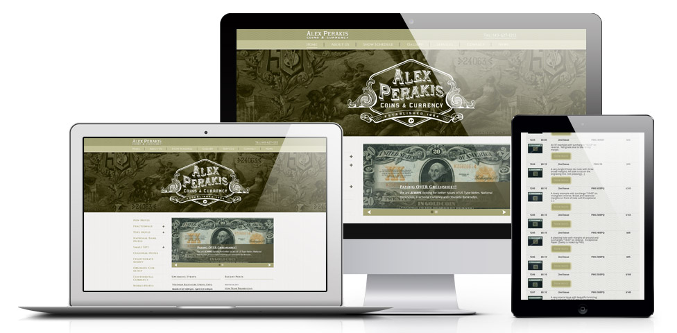
Take a look at an example of a site we did for Perakis Currency. This gives you an idea of how the look of the site changes based on the size of the screen.
Non-responsive websites can still be mobile-friendly. Many of our client websites have been fitted with a mobile-friendly website even though they are not truly responsive designs. This is a much easier way to make a website mobile-friendly without completely redesigning and rebuilding it. This software detects if the visitor is using a mobile device and shows a separate theme for these visitors.
 Pros of a Mobile-Friendly Site
- Runs off of same WordPress pages – no need to update a separate mobile website
- URL’s of the pages are the same – many websites you will see a mobile subdomain like m.boomvisibility.com. Our mobile solution does not require this.
- Easy to setup – most mobile design projects are less than $500.
Cons of a Mobile-Friendly Site
- Often requires a separate home page URL that needs to be updated separately.
- Uses a lot of extra code – the site is a little slower, the software requires updating.
- Often does not include sidebar information. It takes extra work to setup custom templates for the mobile site to match custom templates on the website.
What Else is New?
 WordPress has grown into the most popular content management system in the world. This means that there are a lot of support resources and a lot of great software add-ons that can add extra features with very little effort. The flip side of this is that WordPress is now the subject of hacking attempts. Similar to the PC vs Mac debate, the more popular you are, the more incentive there is for someone to find a security loophole.
To stay secure, Boom Visibility is using less third-party software, and taking many other security measures. In all new website projects, third-party add-ons are carefully vetted and custom code is used in place of a popular piece of code that requires updating and could be the subject of an attack. In general, our newer websites are simpler because custom code replaces software that would include extra functionality and potential security issues. We only use what we need.
When Do I Need to Redesign?
We will be redesigning the Boom Visibility website to be responsive this summer, after about three years since the last time it was redesigned. Obviously a web design company needs to stay up with the latest trends more so than other types of businesses. Five years is usually what we tell people as a rule of thumb. If you paid for a talented designer to do a custom design, your website will continue to look professional and modern for more than five years. If you picked a template off the shelf, your website may appear old in less than five years.
Think you might be interested in a new website? Read about the factors that go into pricing a website.

